Data Dashboard
1.Overview
The Dashboard can bring related charts (indicators) all together, such as customer attribute analysis, behavior analysis, and funnel analysis, making it convenient to view the corresponding daily analysis. You can discover associations from multiple charts, or you can perform in-depth analysis on a single chart. Normally, different roles have different requirements for data analysis:
Product Manager:View the core data of the product
Marketing:View metrics from various channel or sources
Operation:Check the conversion rate of the corresponding content
Dashboard can classify charts by same type of business, which can solve this problem.
2.Default dashboard
The default dashboard is a fixed dashboard provided by DM Hub. The system defaults to the customer’s basic dashboard and industry dashboard, which can meet part of the data analysis needs. If you have more needs, you can add your own custom dashboard. The default dashboard components cannot be edited, can be viewed and downloaded only.
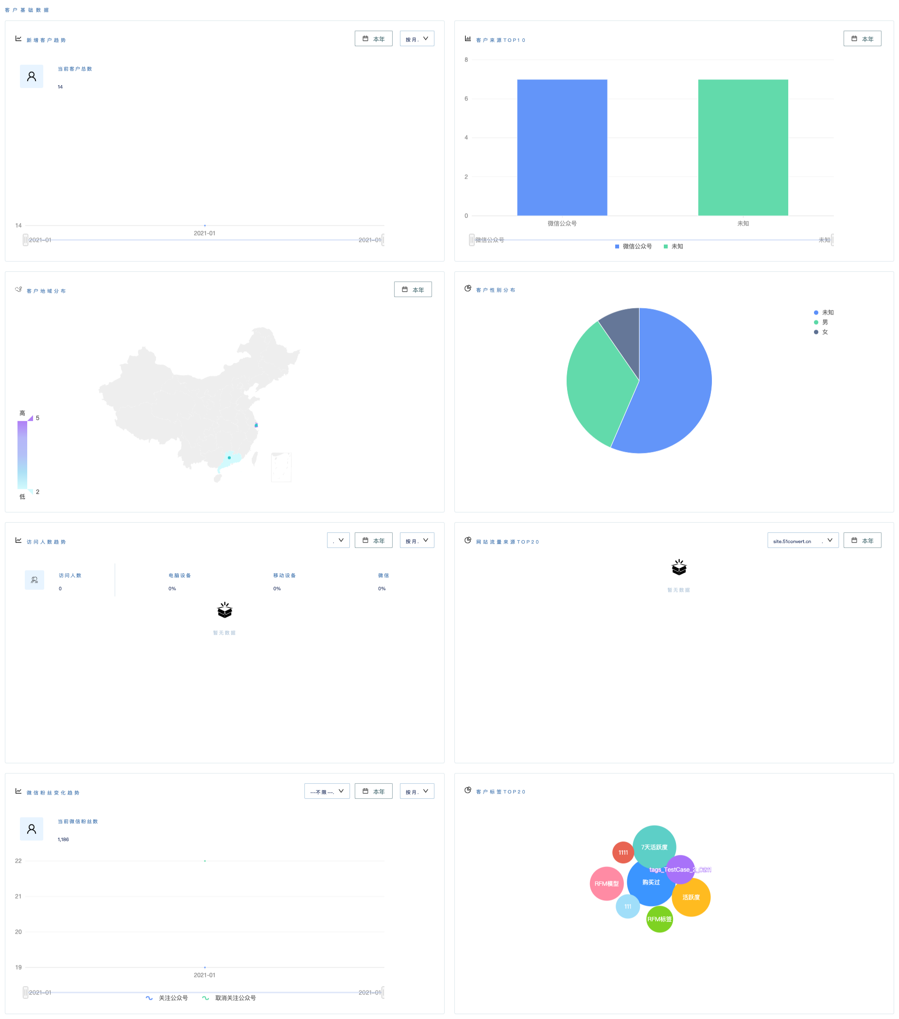
2.1Basic dashboard
The basic dashboard can view eight types of data of customer information:
- New customer trend:You can select the time range and dimension to display the new customer trend on a daily/weekly/monthly/yearly basis, within a certain period of time
- TOP10 customer sources:You can select the time range to display the top 10 sources of customers within a certain period of time, to evaluate the performance on different sources
- Customer geographical distribution:you can select the time range to display the geographical distribution of customers within a certain period of time
- Customer gender distribution:display the gender distribution of customers
- Visitors trend:By selecting the time range and dimension, it can display the visit trend and proportion of a certain website or webpage on the computer, mobile and WeChat every day/week/month/year within a certain period of time
- TOP20 website traffic sources:You can select the time range to display the top 20 sources of website traffic within a certain period of time
- The trend of WeChat followers:You can select the time range and dimension to display the new and unfollowed fans of different official accounts on a daily/weekly/monthly/yearly basis within a certain period of time
- TOP20 customer tags:display the distribution of customer tags
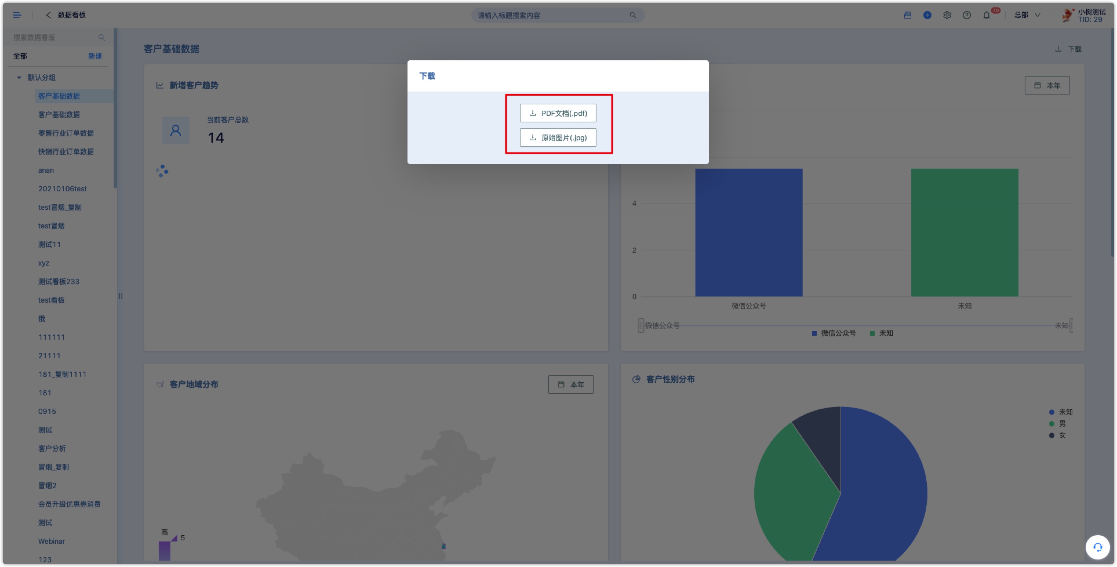
Data can be downloaded in jpg and pdf format
2.2Industry dashboard
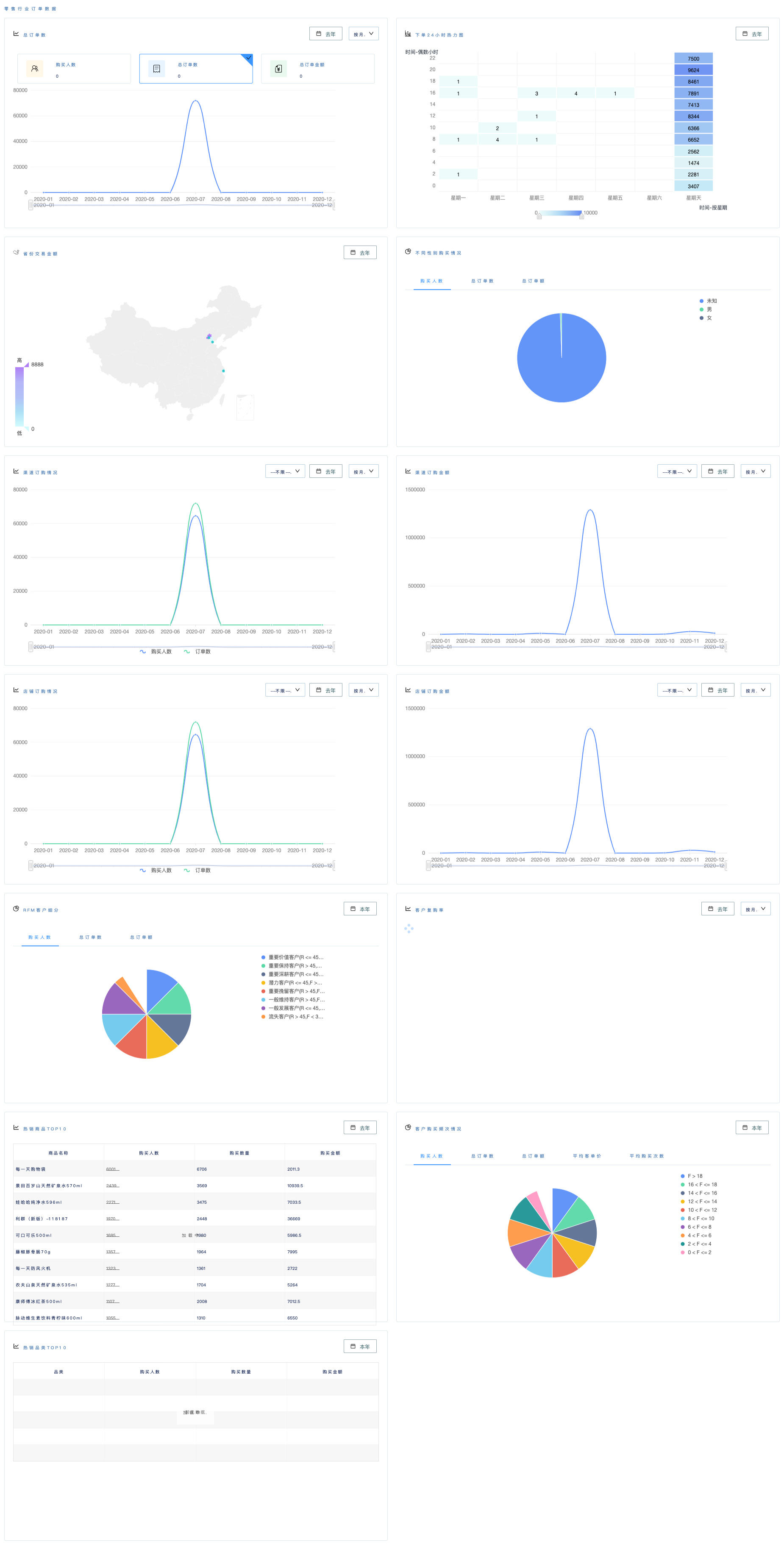
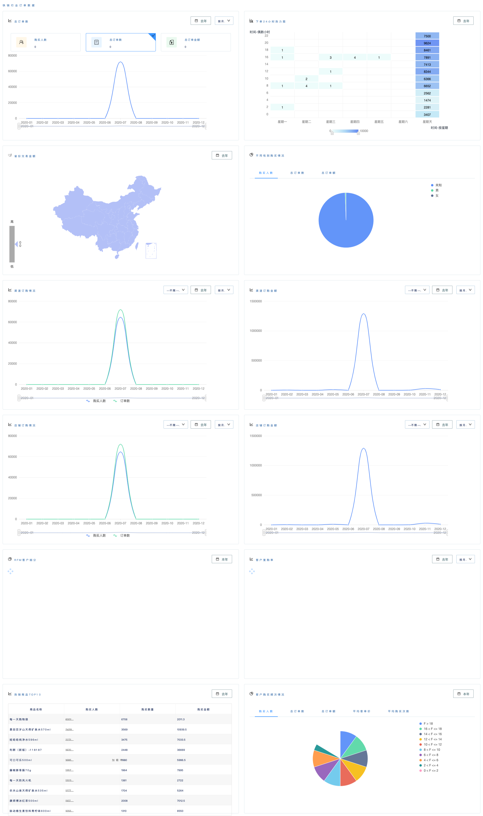
In addition to the basic dashboard, for different industries, DM Hub also builds two dashboards in the retail and fast-moving industries by default. You can view the following data:
- Total orders:You can select the time range and dimension to display the trend of total orders per day/week/month/year within a certain period of time
- 24-hour heat map for placing an order:you can select a time range to display a 24-hour heat map for placing an order within a certain period of time
- Provincial transaction amount:You can select the time range to display the transaction amount of each province within a certain period of time
- Purchase comparison by gender:display sales proportion of male customers and female customers
- Channel order status:You can select the time range and dimension to display the number of purchasers and orders in a channel every day/week/month/year within a certain period of time
- Order statistics by channel:You can select the time range and dimension to display the order amount in a channel every day/week/month/year within a certain period of time
- Store order status:you can select the time range and dimension to display the number of purchasers and the number of orders in a store every day/week/month/year within a certain period of time
- Store order amount:You can select the time range and dimension to display the order amount of a store by every day/week/month/year within a certain period of time
- RFM customer segmentation:It can display the number of purchasers, total orders and total order amount of RFM in the DM Hub
- Customer repurchase rate:You can select the time range and dimension to display the customer repurchase rate per day/week/month/year within a certain period of time
- Top 10 hot-selling products:You can select the time range to display the top ten hot-selling products within a certain period of time
- Customer purchase frequency:You can select the time range to display the number of purchasers, total orders, total order amount, per customer transaction and average purchase times of different customers' purchase frequency within a certain period of time
- Top 10 hot-selling categories (retail industry only):You can select the time range to display the top 10 hot-selling categories within a certain period of time
Retail industry order data dashboard::
FMCG industry order data dashboard::
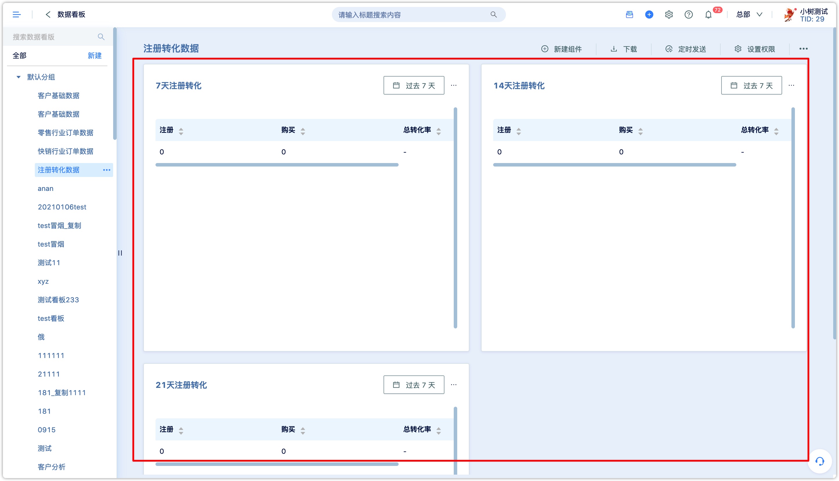
3.custom dashboard
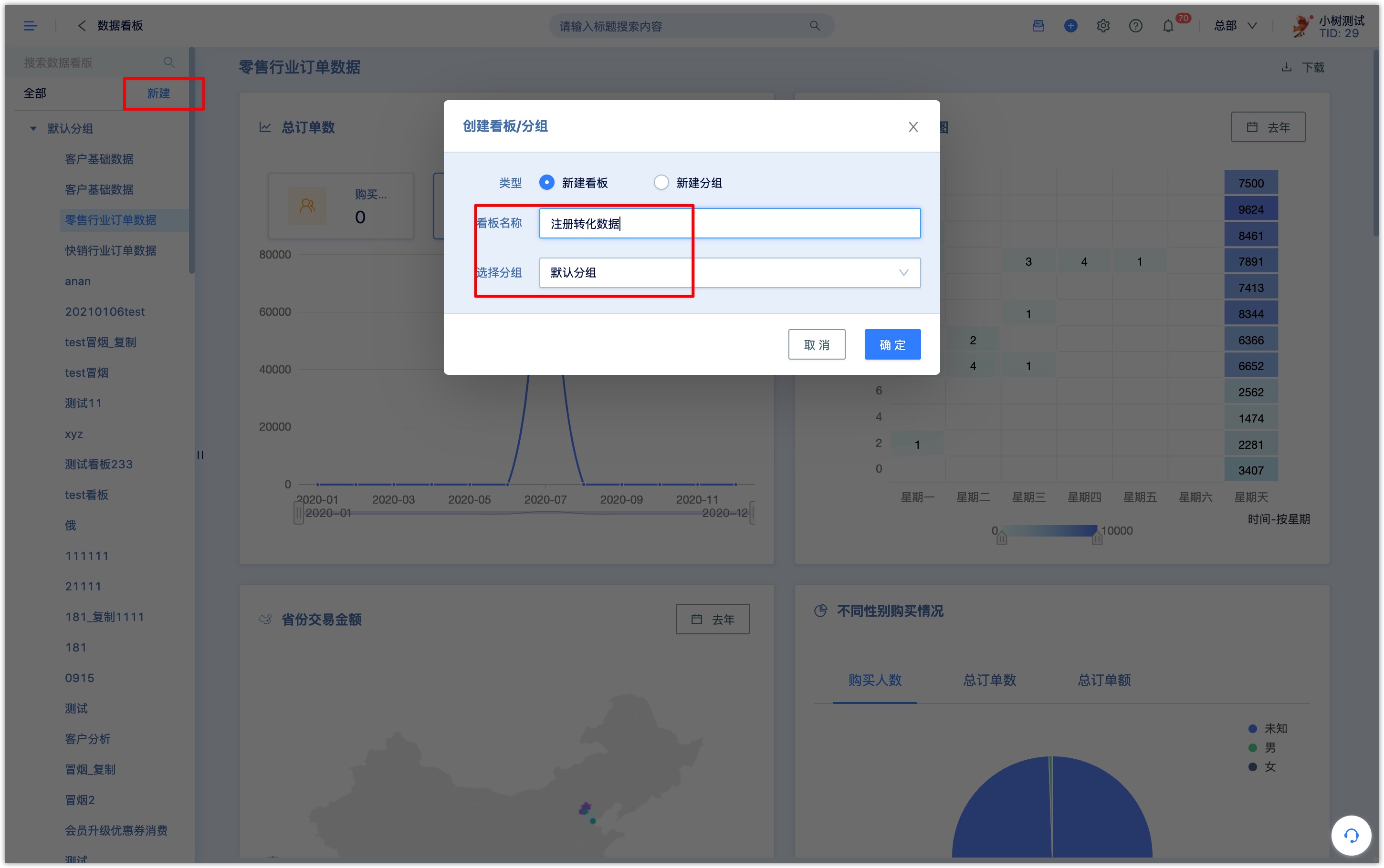
3.1How to create a custom dashboard
- Create a new dashboard Click the [New] button on the left side of the page, enter a name for the dashboard, and select a dashboard category for it.
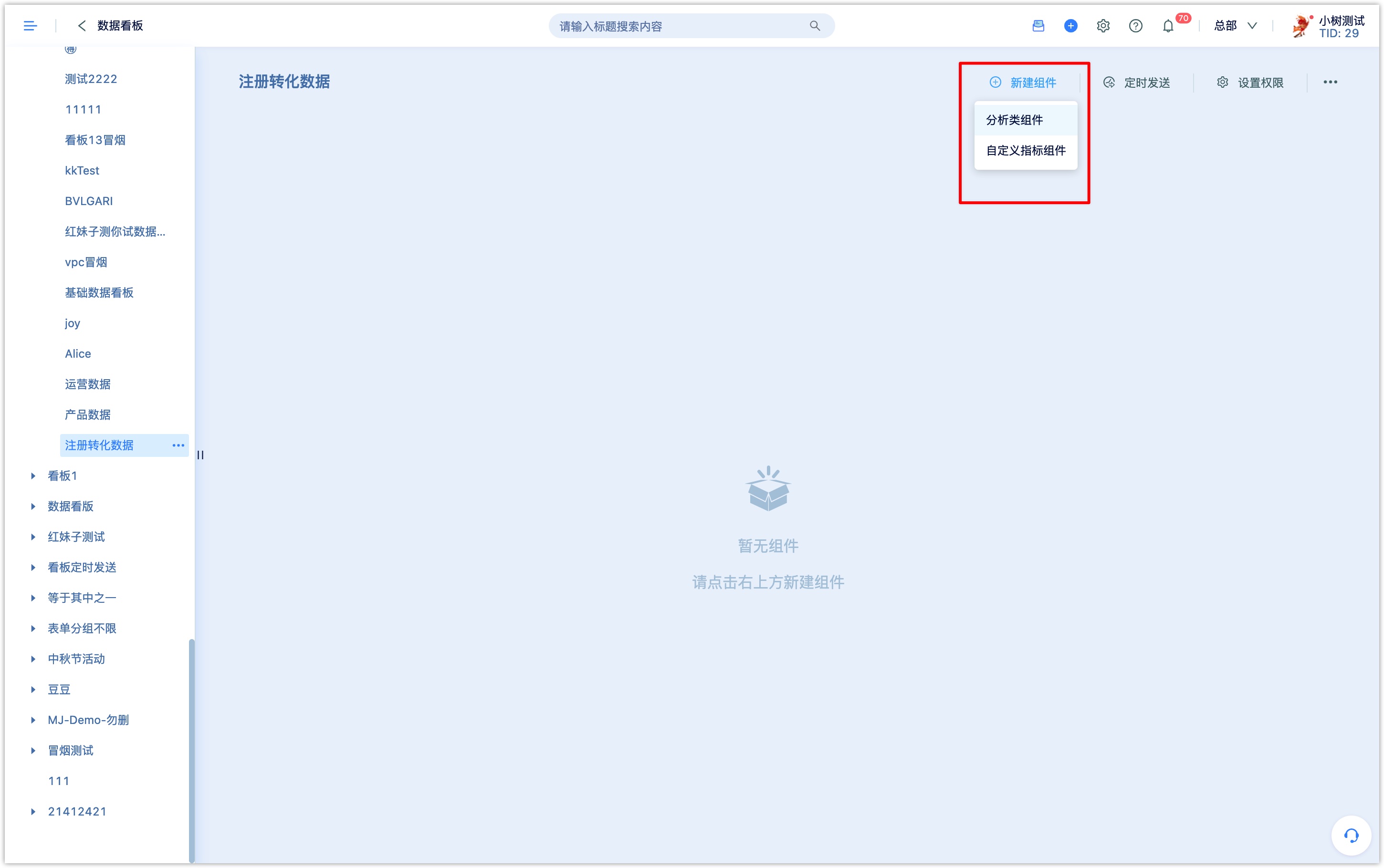
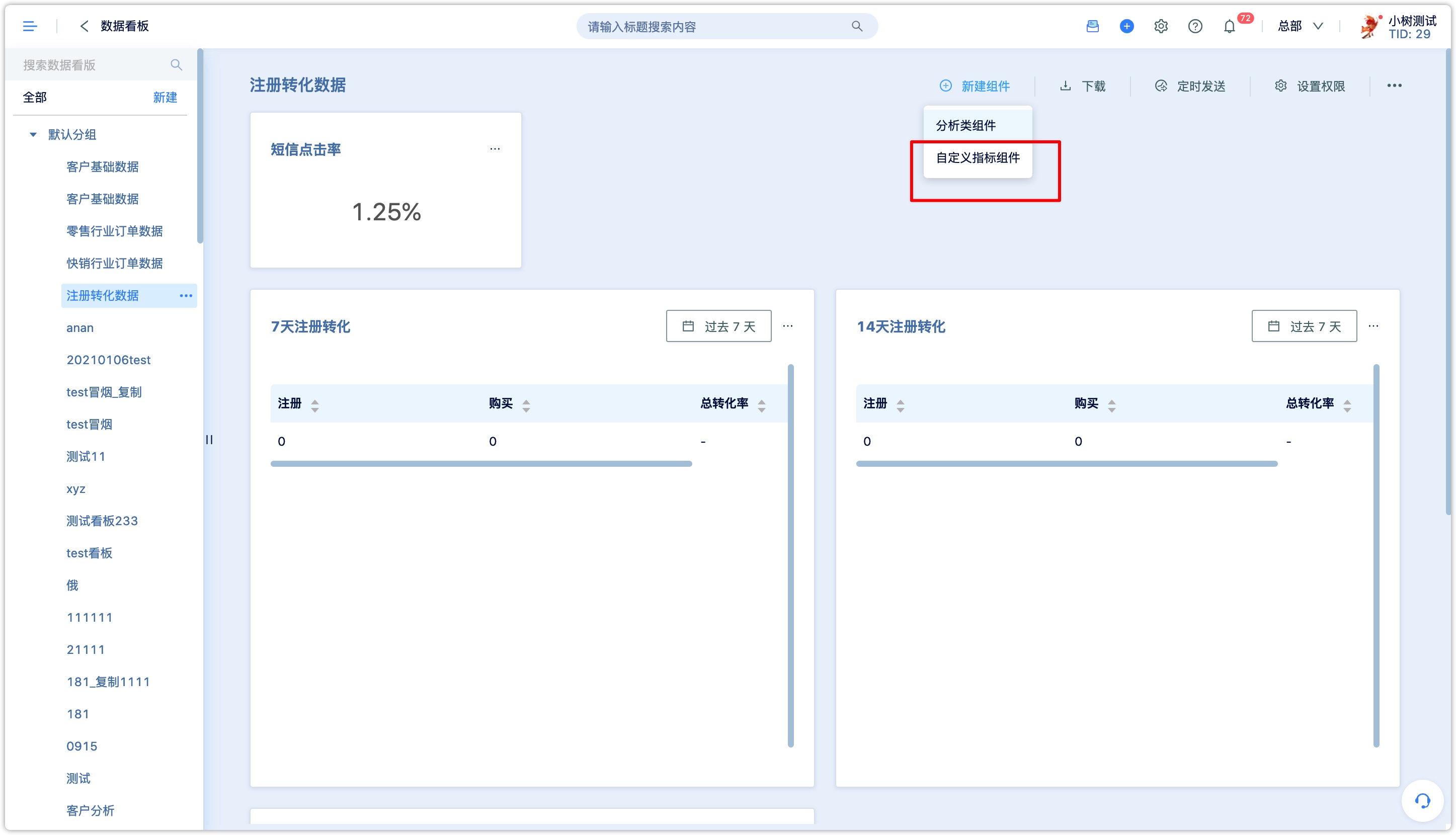
- 2.Add new component
Click [New Component] to create a chart, sub-category components, custom indicator components, and analysis components are supported.
Analysis components:
Click the analysis component to enter the analysis center and select the appropriate analysis and chart type according to the definition and usage of each analysis.
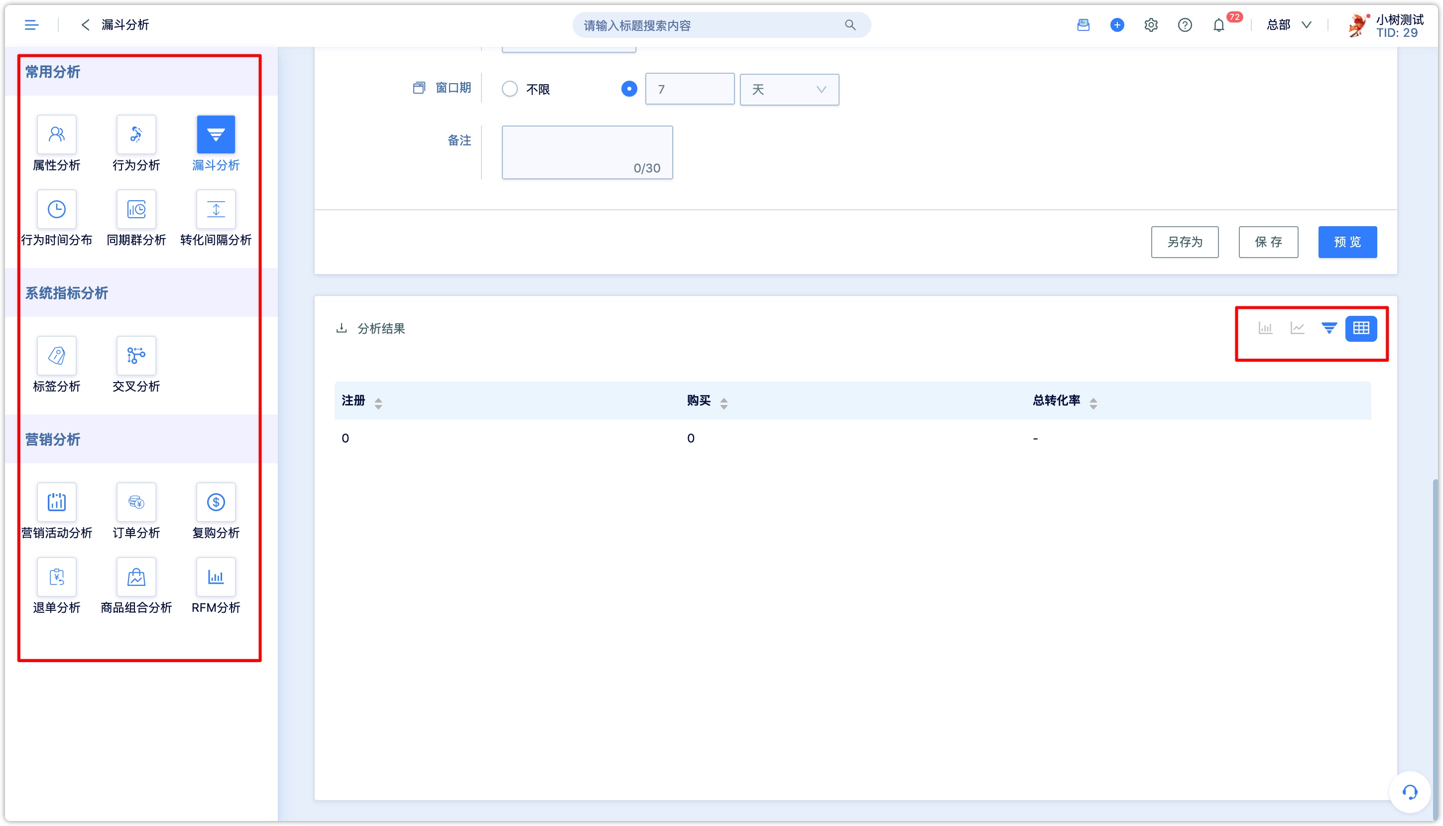
There are several chart types (the [table] type is selected by default), which are suitable for different following analysis scenarios and restrictions:
- Indicator type: It is suitable for no dimension subdivision needs, only setting one indicator and looking at an aggregate value.
——Suitable for analysis: total number of customers, number of new customers today, sales today, number of new followers today, and number of new followers in the past 30 days.
- China map type: applicable to within two dimensions, only one indicator is set, and the first dimension is province.
——Suitable analysis conditions: the number of people is distributed by province, the activity is distributed by province, and the sales are distributed by province.
- Histogram: Applicable to within two dimensions, only one indicator is set.
——It is often used for data comparison, normally comparing between A and B at the same time.
- Trend chart:Applicable to within two dimensions, only one indicator is set.
——It is conducive to show the trend of change and reflect the growth rate through the curve.
- Pie chart: applicable within one dimension, only one indicator is set
- Table: Multiple dimensions, multiple indicators, suitable for viewing detailed or complex data.
Click [Save] to successfully create the chart to the data dashboard.
Custom indicator components:
You can select the number of indicators, number of people, and order-related indicators for all events in the system, such as purchasers, total order amount, number of orders, etc., and a new custom indicator can be calculated by adding, subtracting, multiplying, and dividing, and save it in the dashboard. For example, you can calculate the purchase conversion rate index, click-through rate index, and registration rate of a certain event.
Click New Component to customize the indicator component
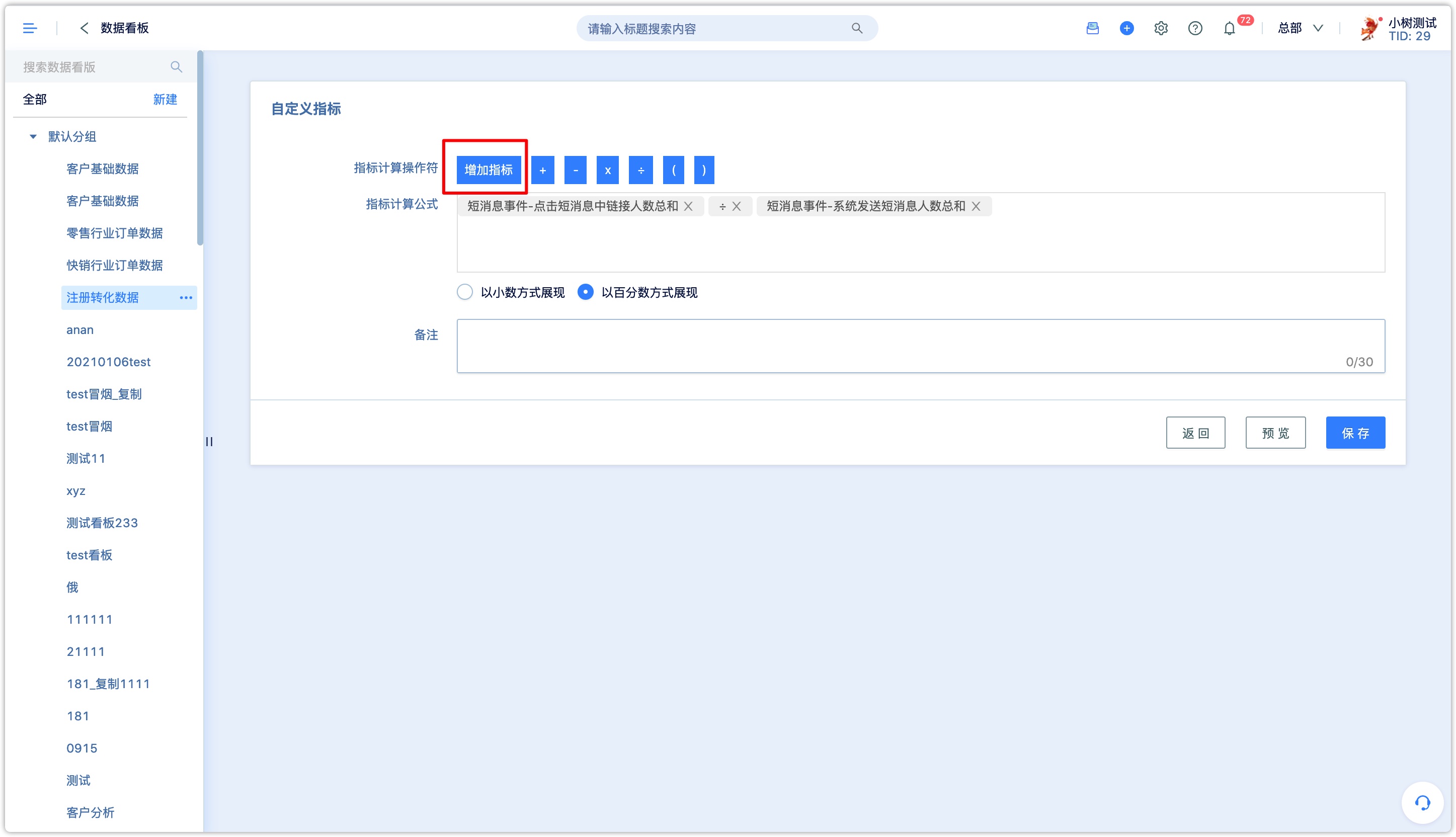
Click [Add Index], select calculation data
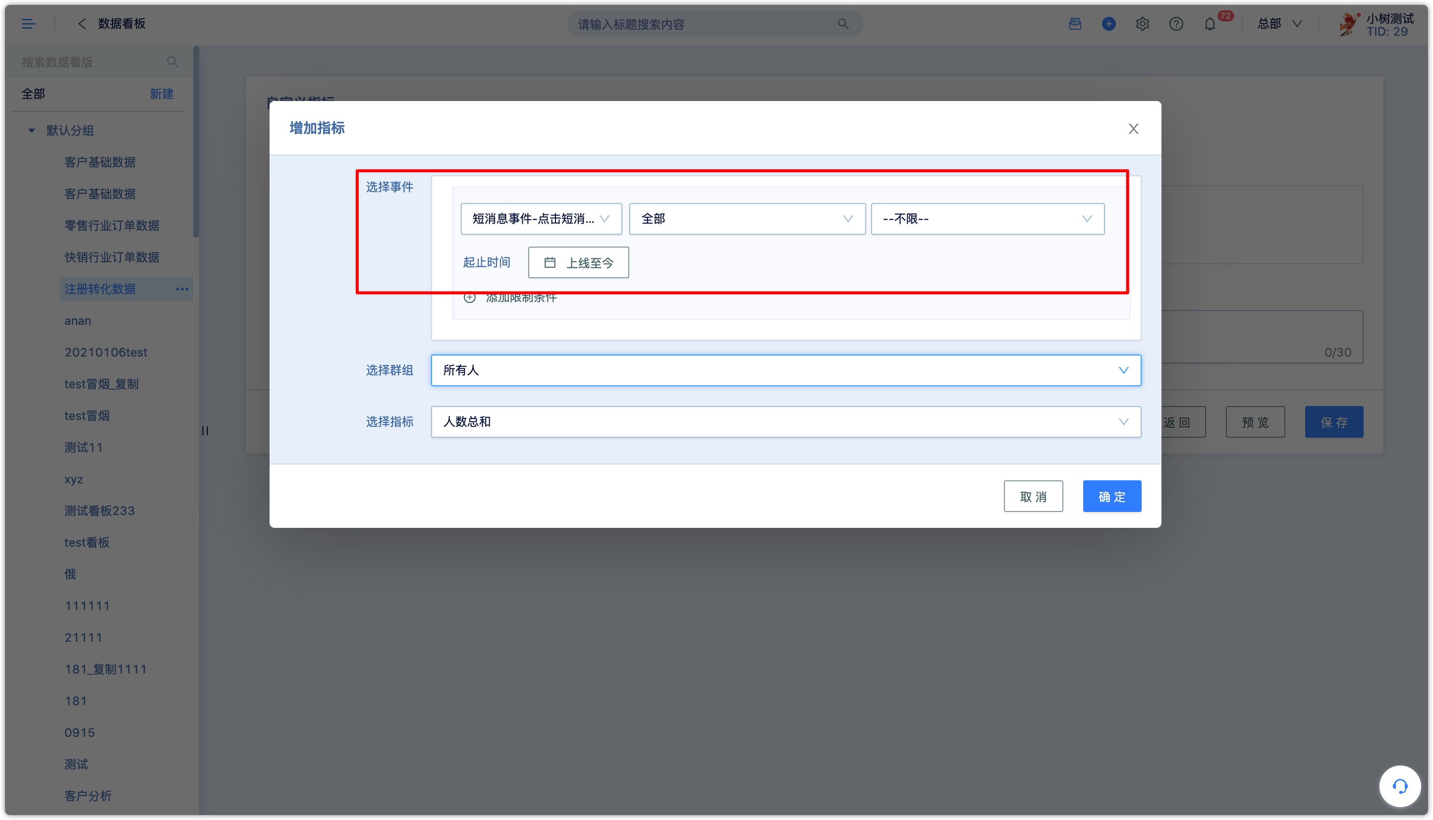
Select algorithm
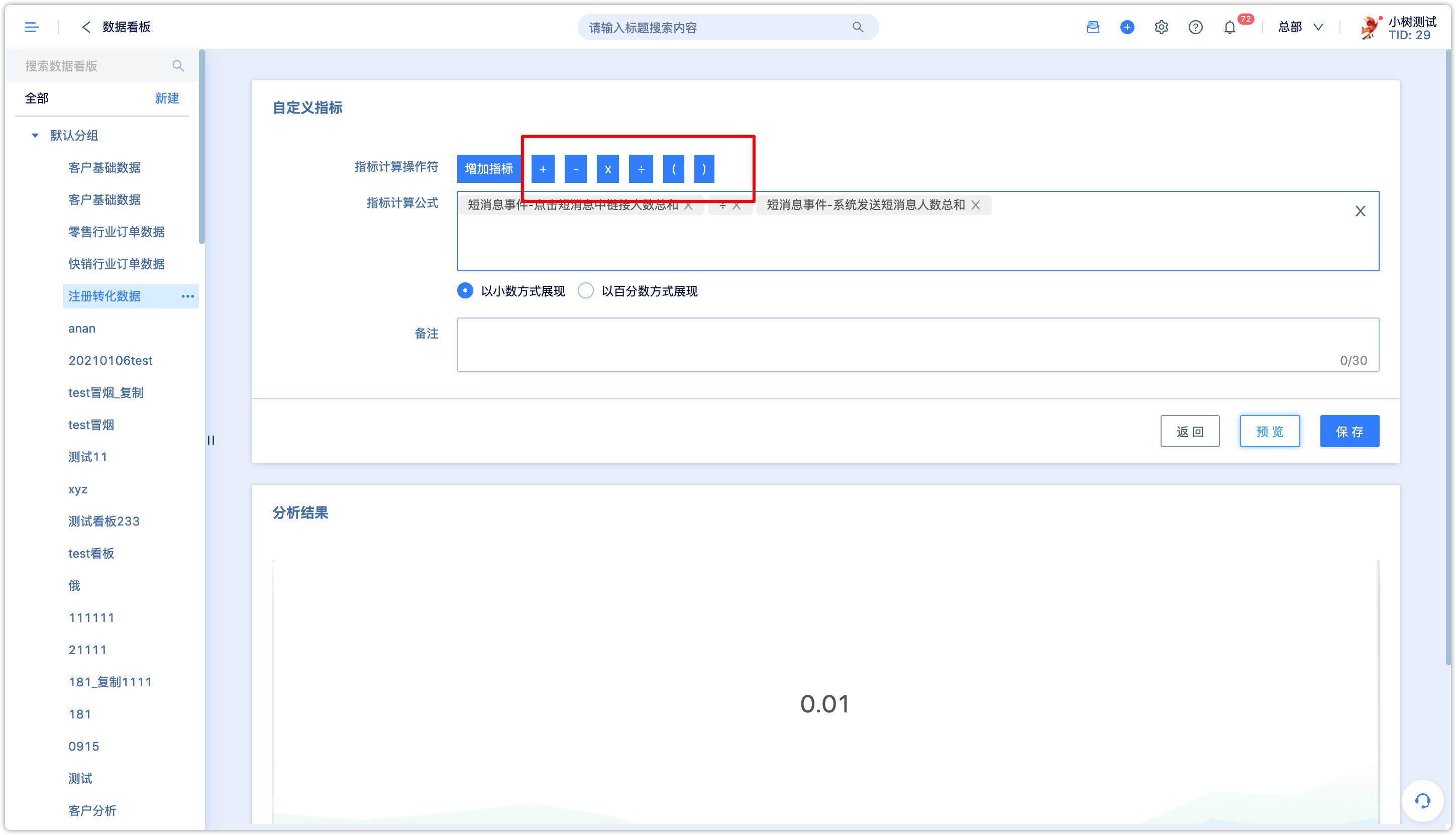
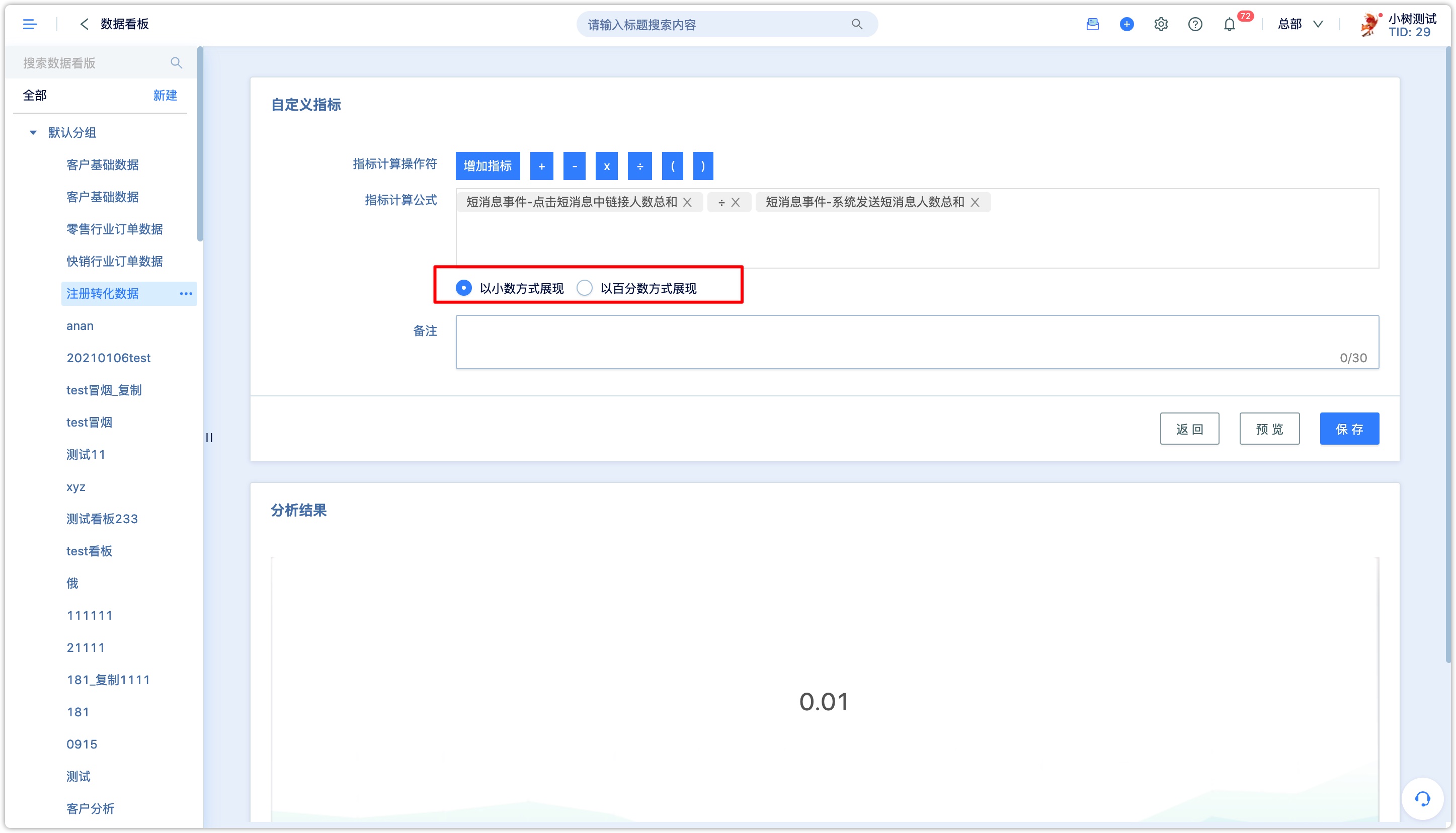
You can choose to display in decimal or percentage
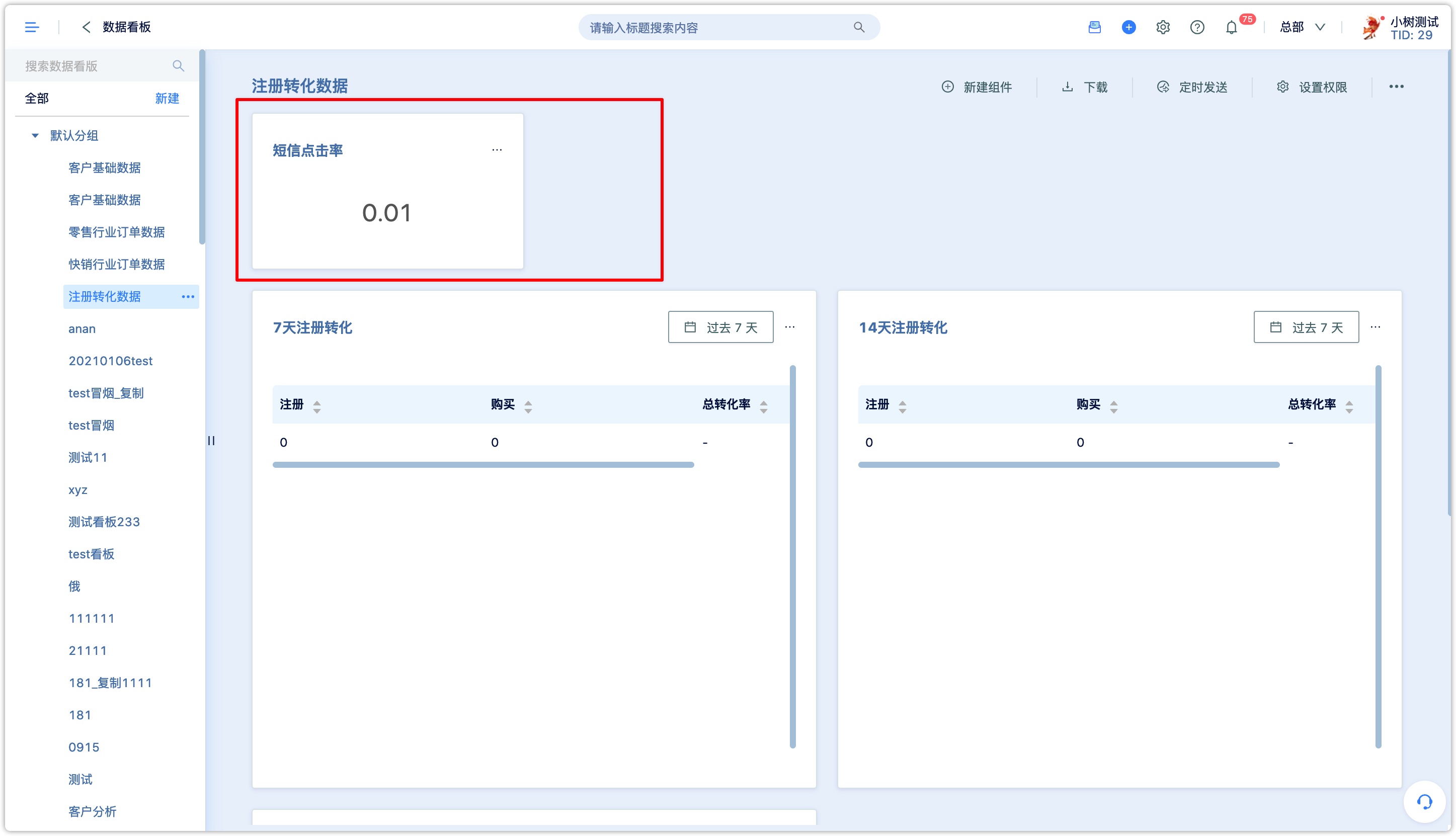
Click [Save] to add to the dashboard
4.Modify the chart
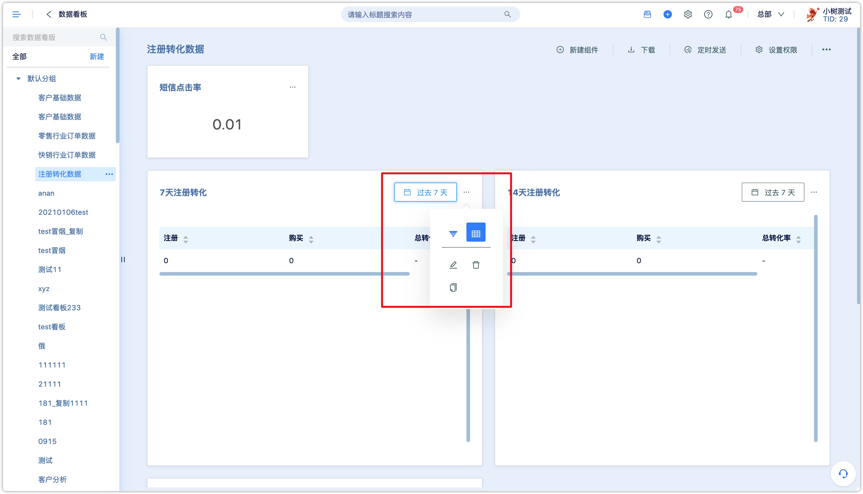
If you need to change the settings of a chart in the dashboard, click the upper right corner of the chart to edit the chart, copy, delete or change the chart type.
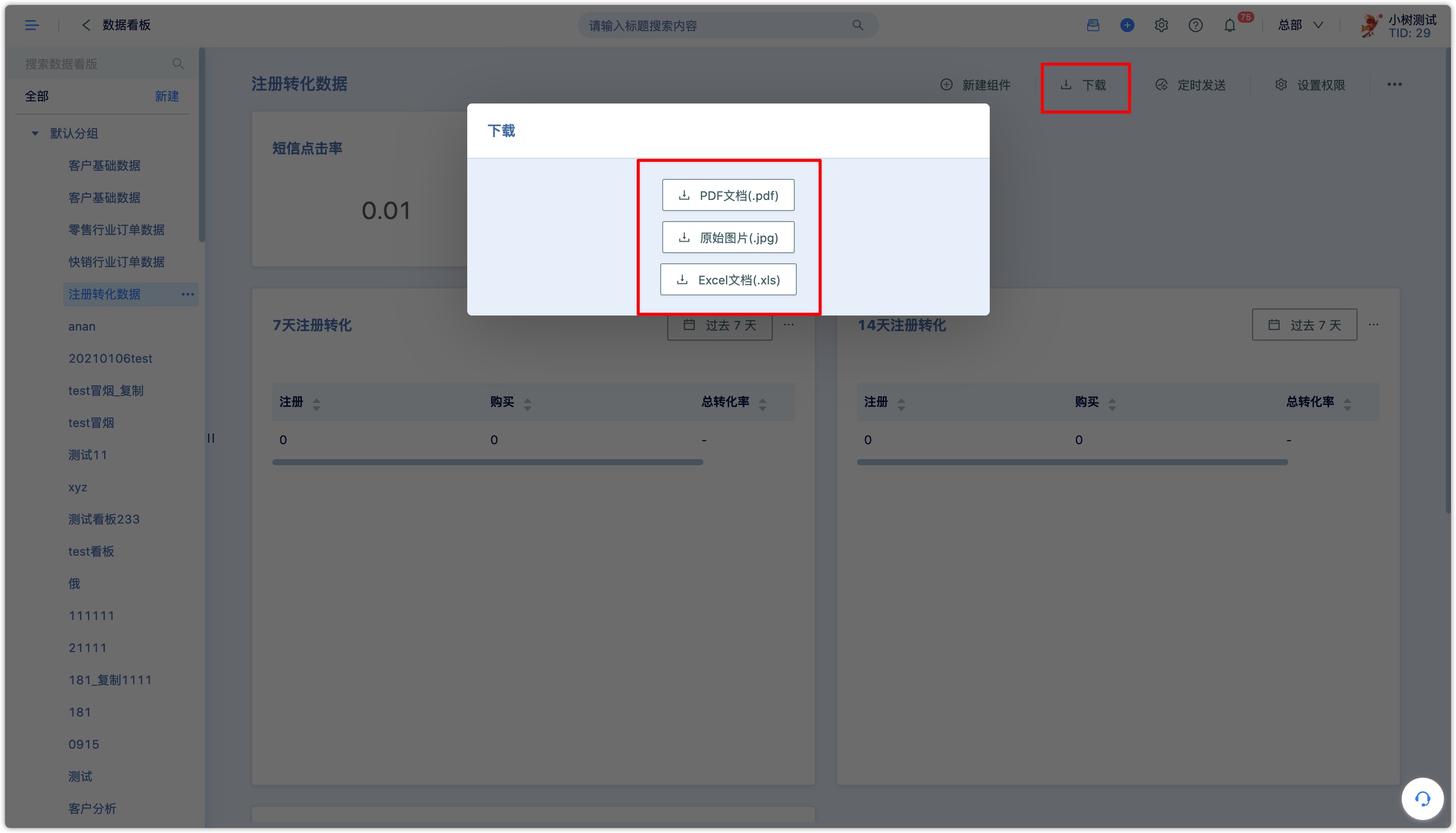
5.Download the report
If you need the entire report for other purposes, you can download the entire report. Click [Download] on the upper right to select the download file format of the report.
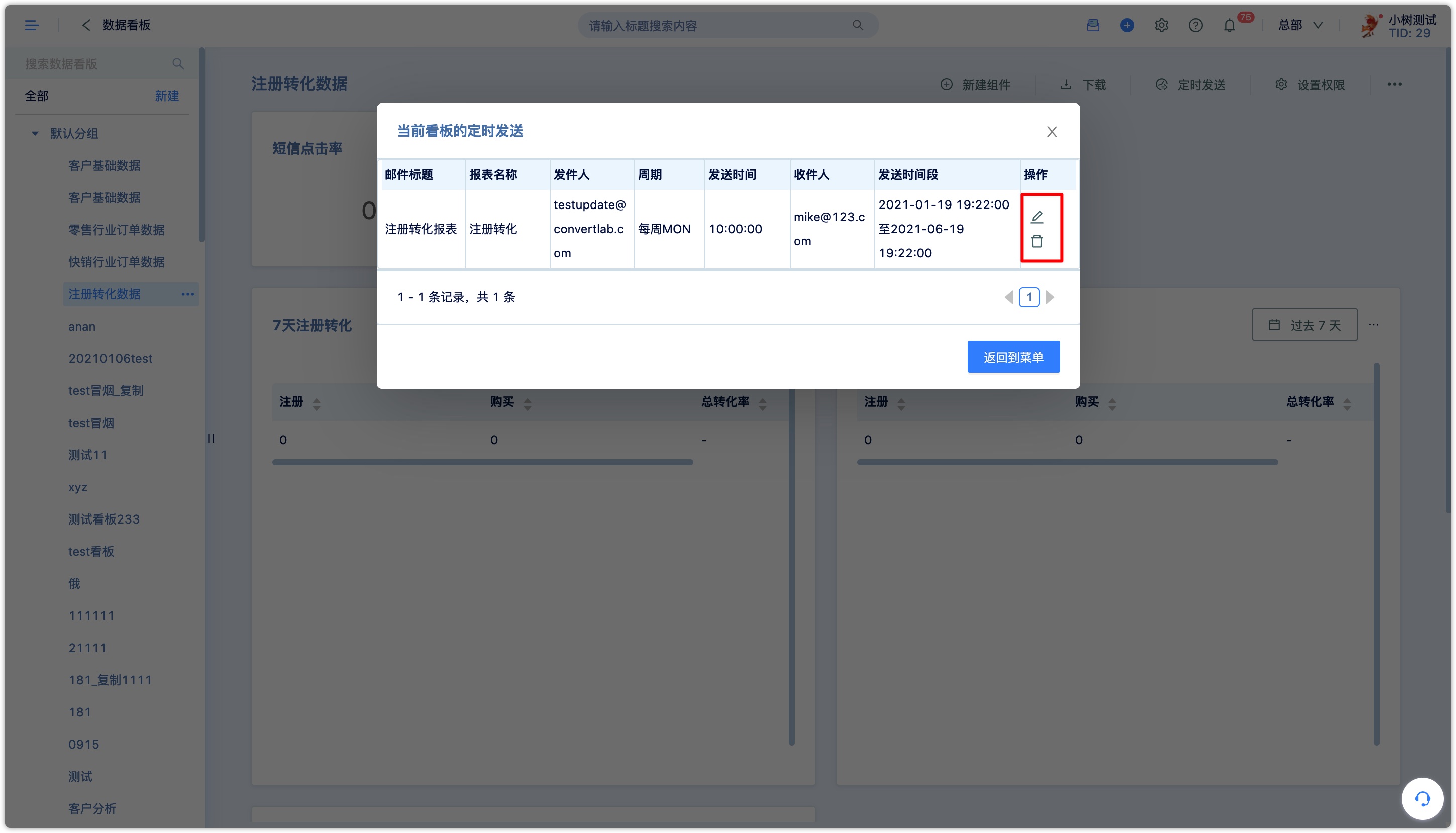
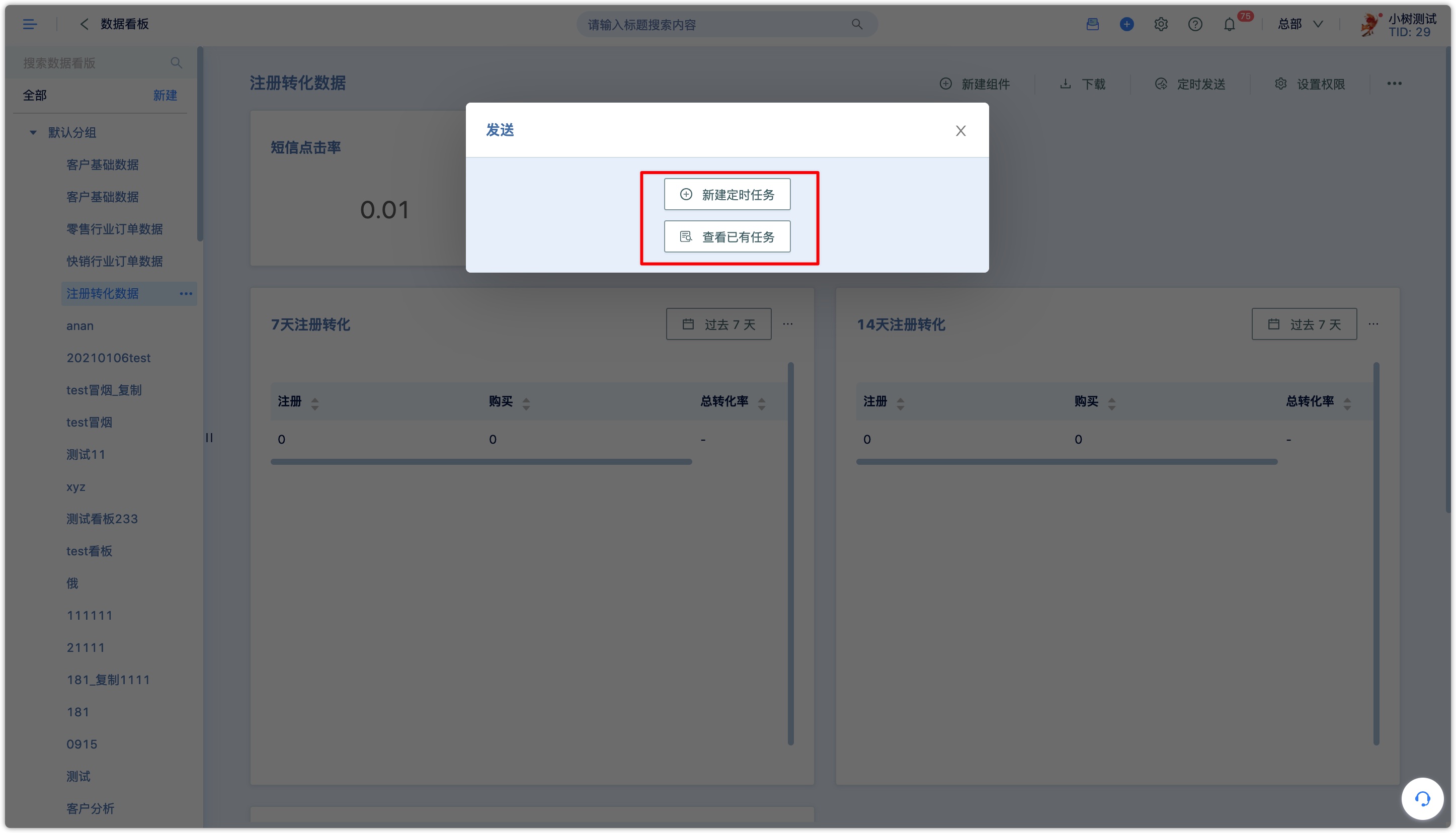
6.Sending the report by email
If necessary, you can send the report to the designated mailbox via email, and you can set up periodic regular sending. Sending reports by mail will consume mail quota.
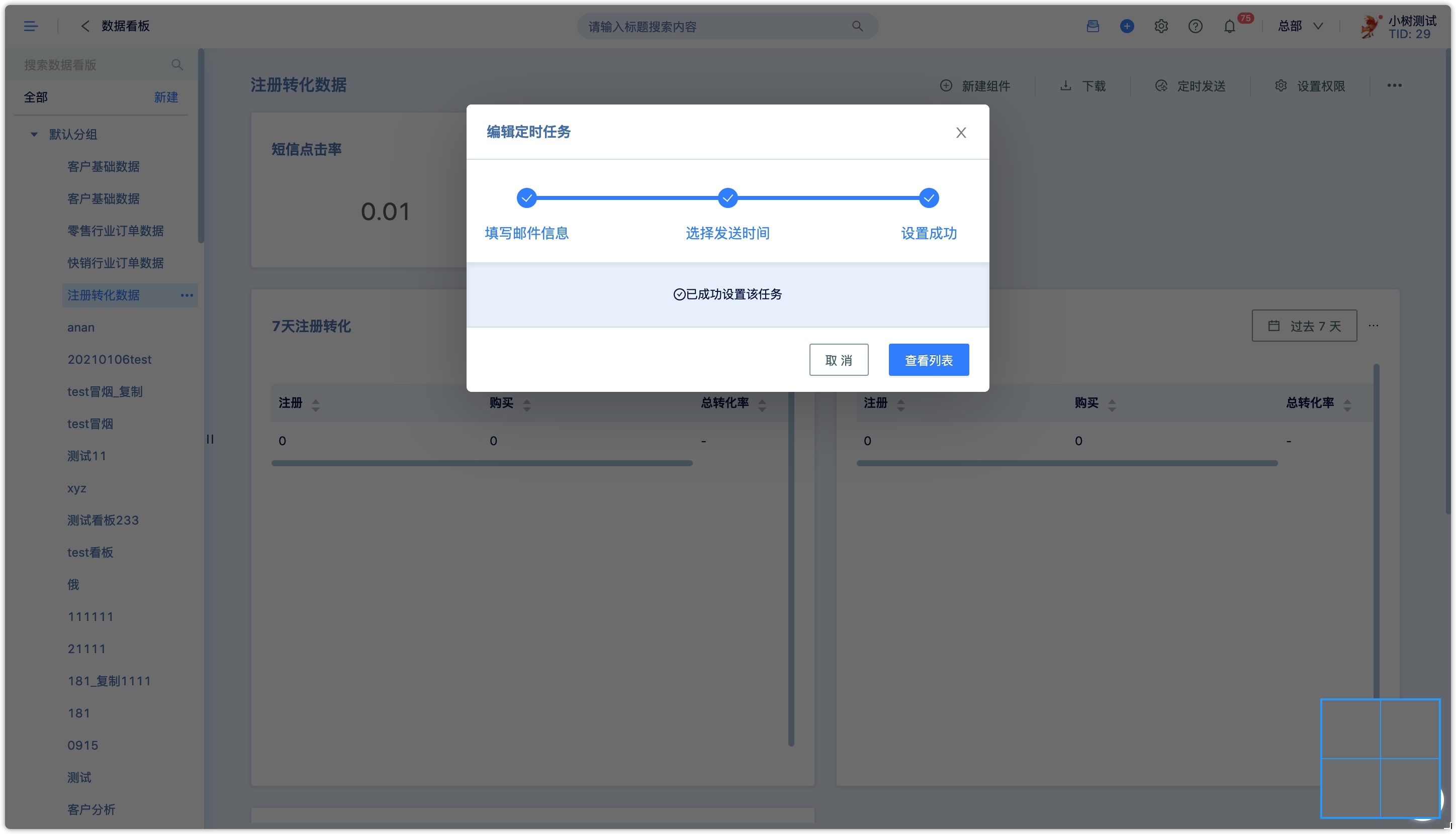
Click [Scheduled Send] in the upper right corner of the dashboard to view the sending tasks that have been set, or create a new one.
- Click [New Scheduled Task] and fill in the email information.
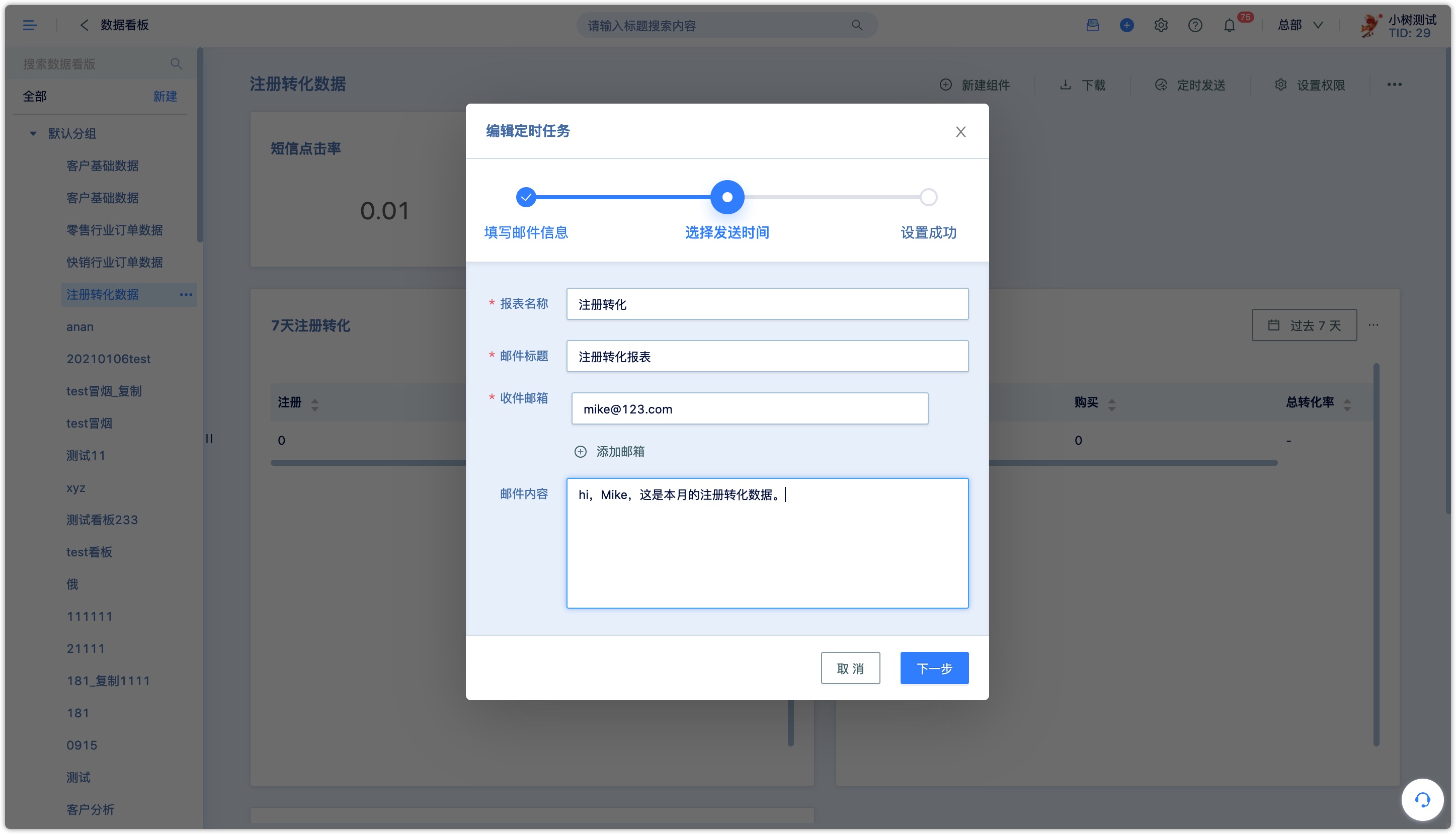
- 2.Select the sending time, send it immediately or send it as a routine.
Timed sending can be sent only once, or periodically at a required time. For example, a report will be sent every Monday at 10 AM in the next 5 months.
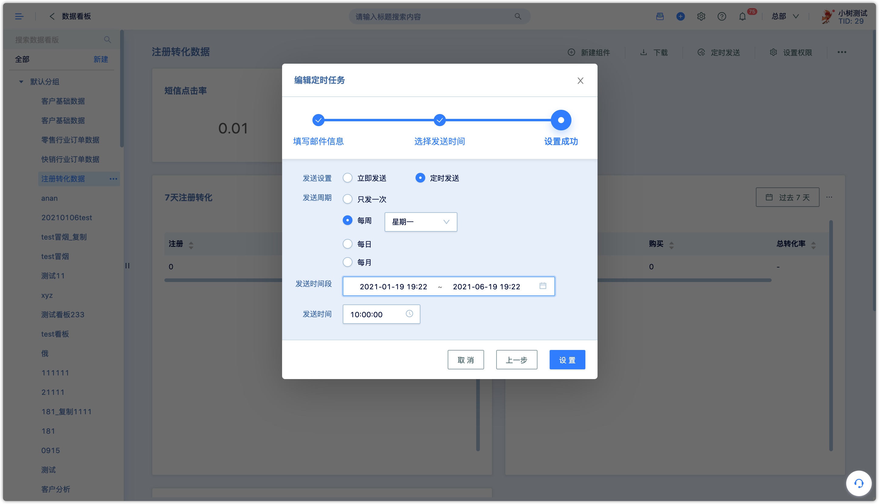
After the setting process is complete, you can view the list.
If there is something wrong with the setting or you don't want to use the set timed sending anymore, you can edit or delete it in [View Existing Tasks].